RMC - Rebranding and environmental graphic
Client:
RMC, transport company (the Netherlands).
RMC, transport company (the Netherlands).
Briefing:
Rebranding of the Dutch company specialised in tailor-made transport of people with physical and mental disabilities.
Rebranding of the Dutch company specialised in tailor-made transport of people with physical and mental disabilities.
Creative fields:
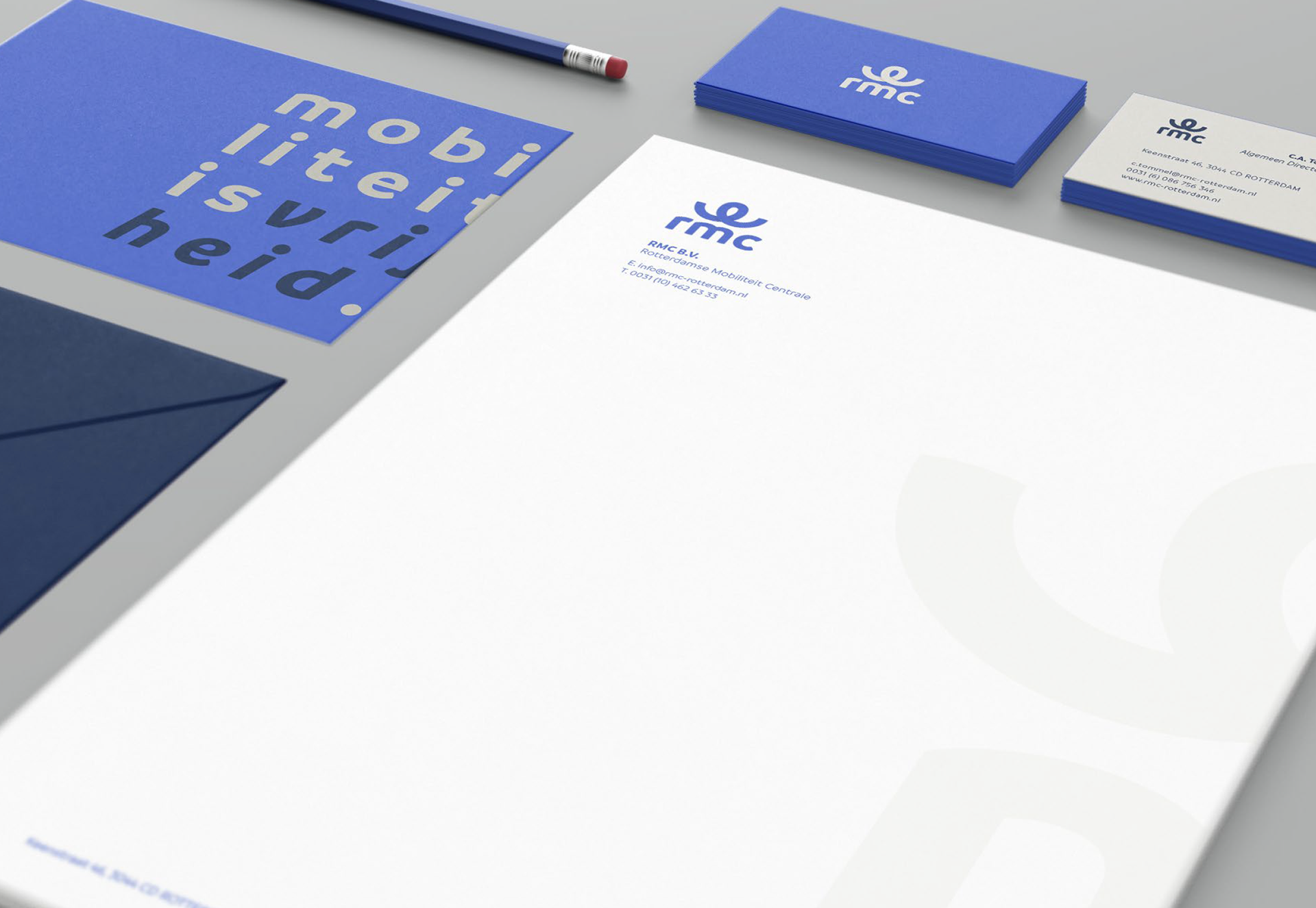
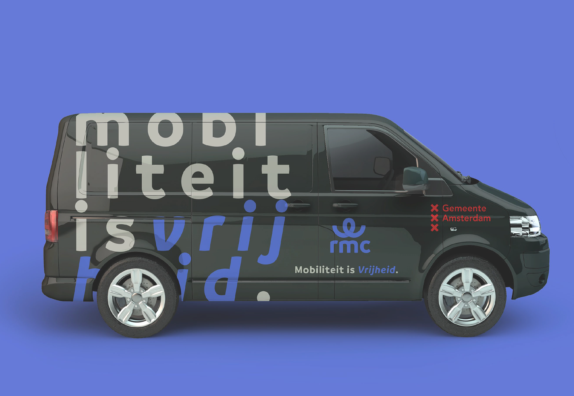
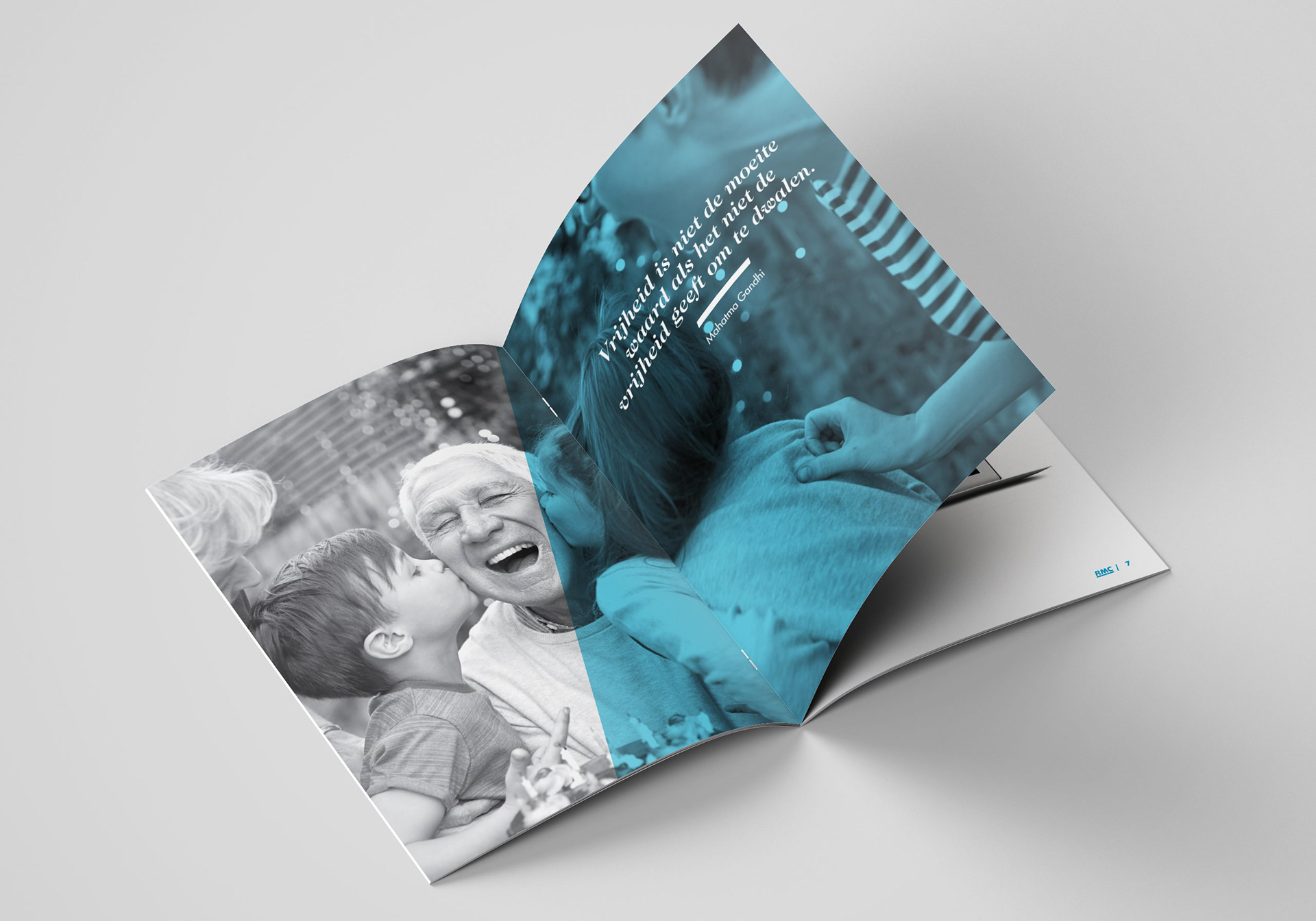
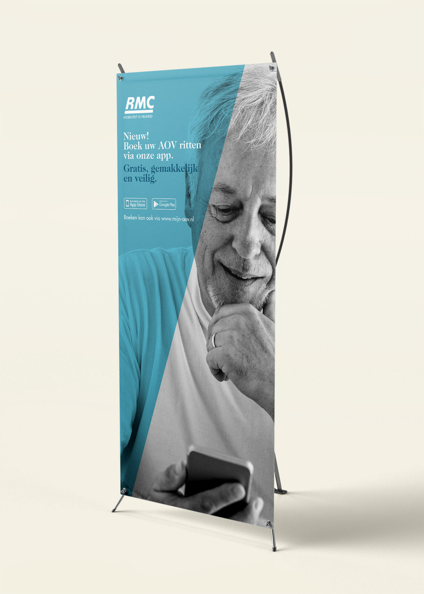
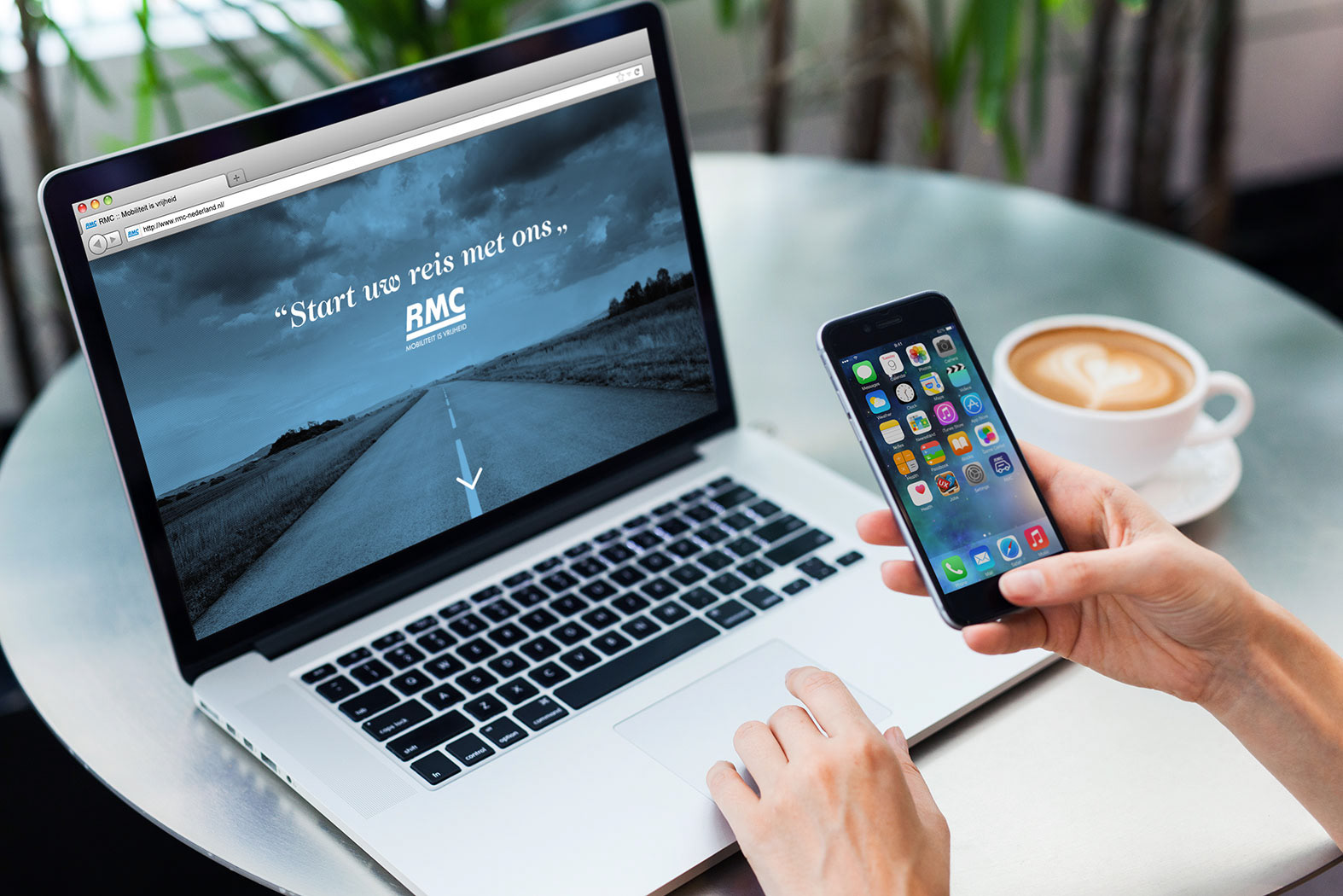
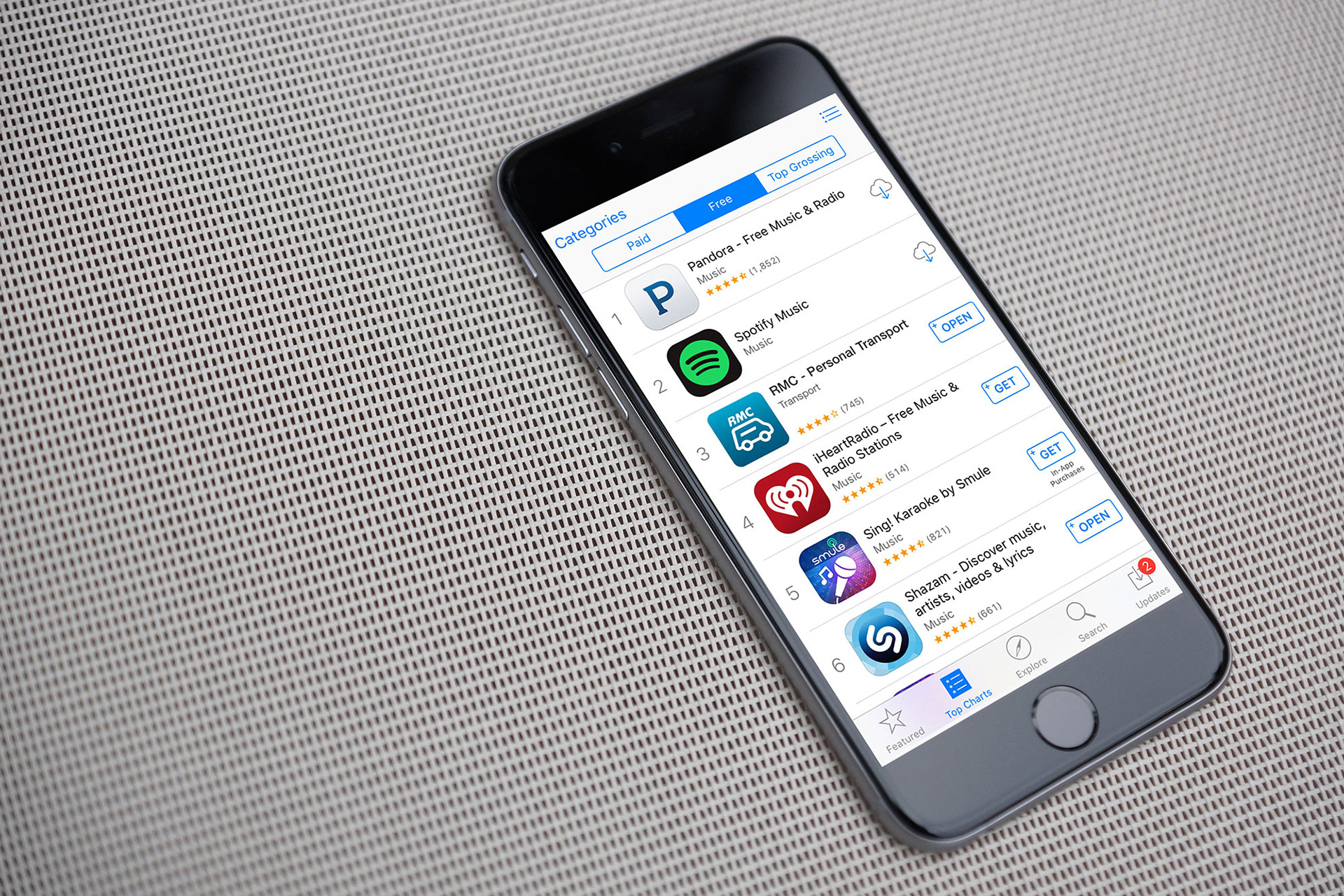
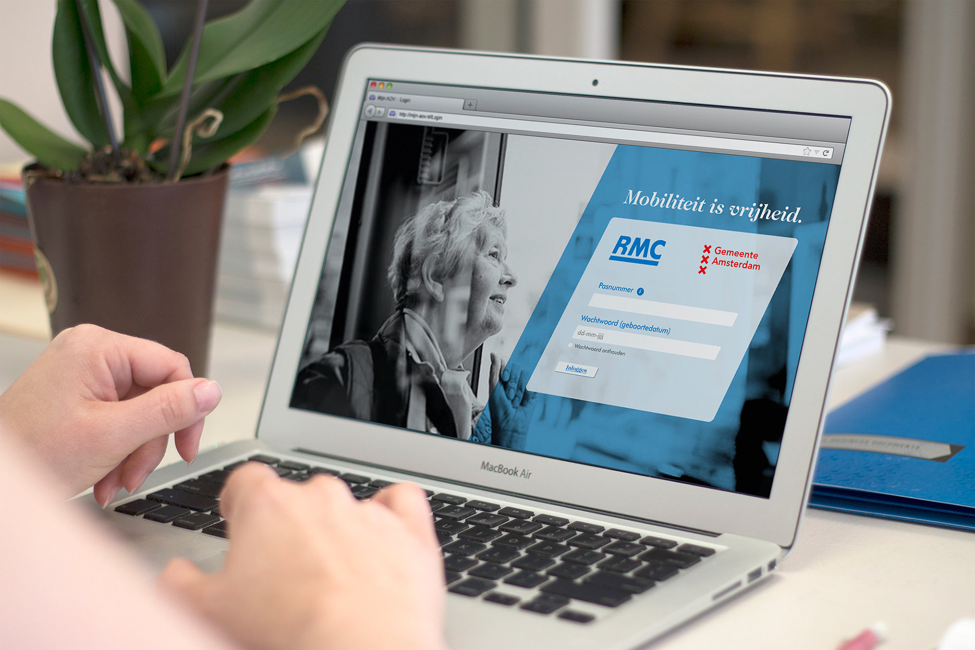
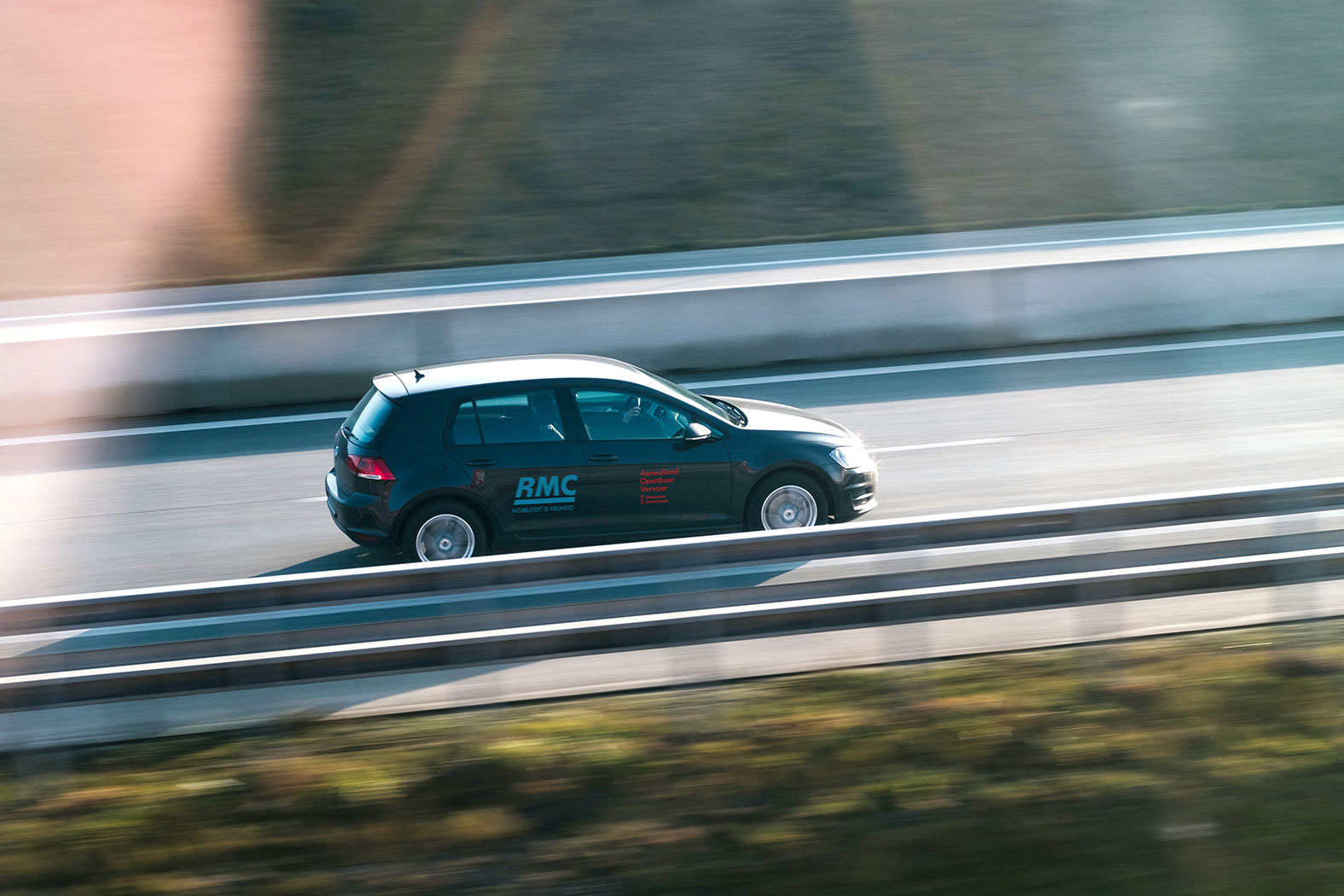
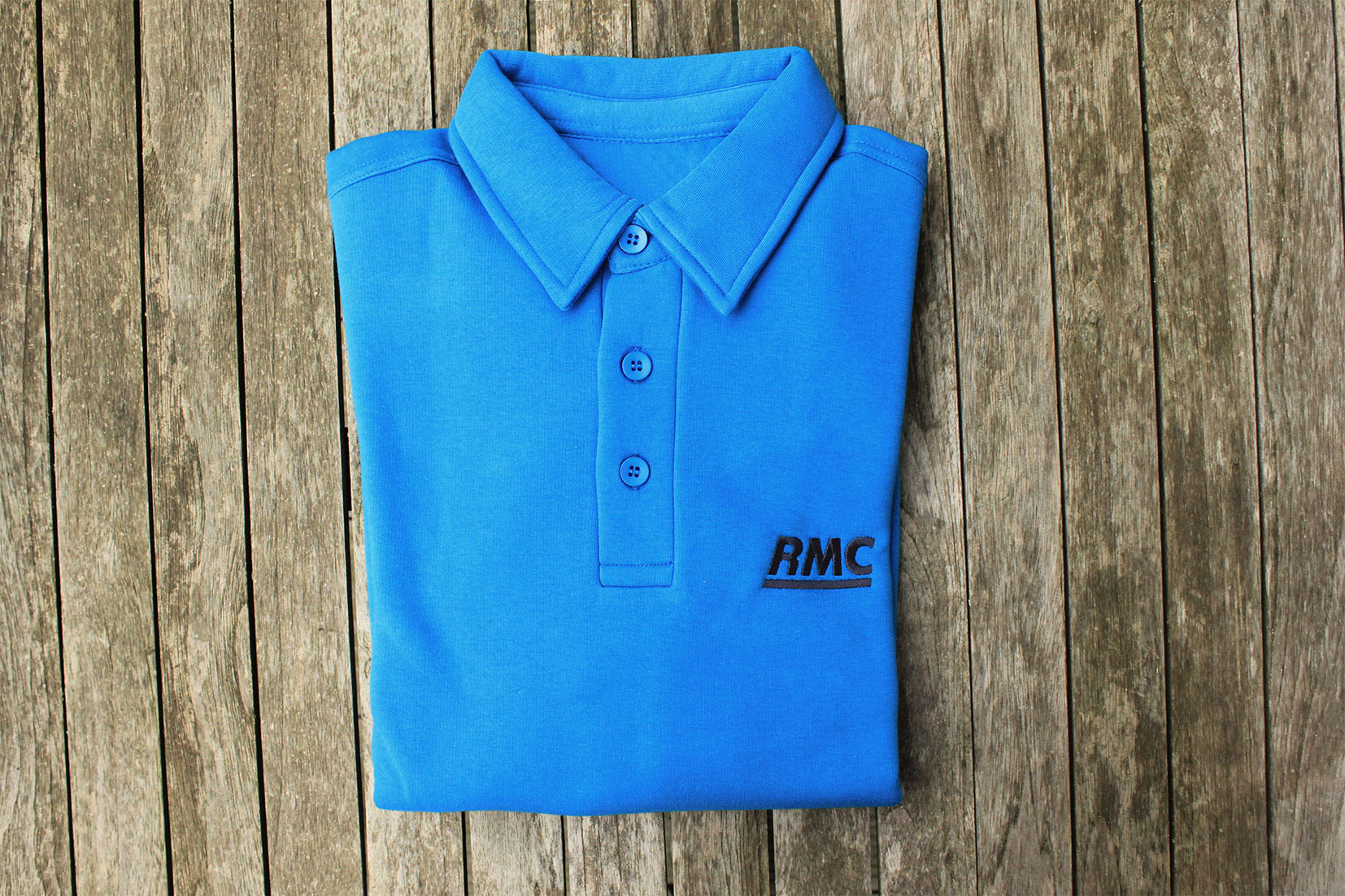
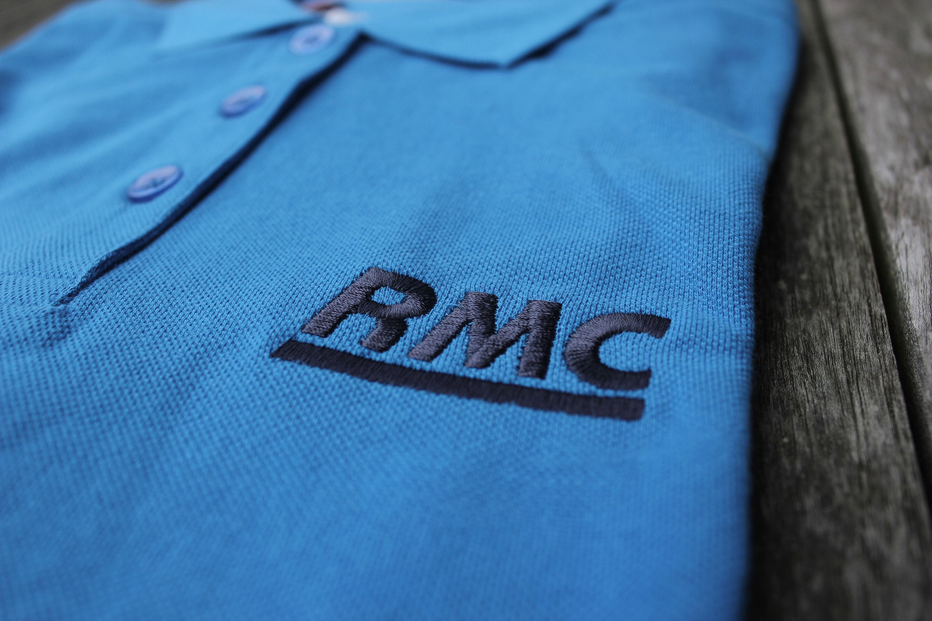
Brand design and roll-out of new brand: logo, business cards, letterhead and envelope, brochure, flyer, clothes, art direction photography, web design, app icon, brand guidelines. Design of environmental graphics of the office spaces in Amsterdam and in Rotterdam.
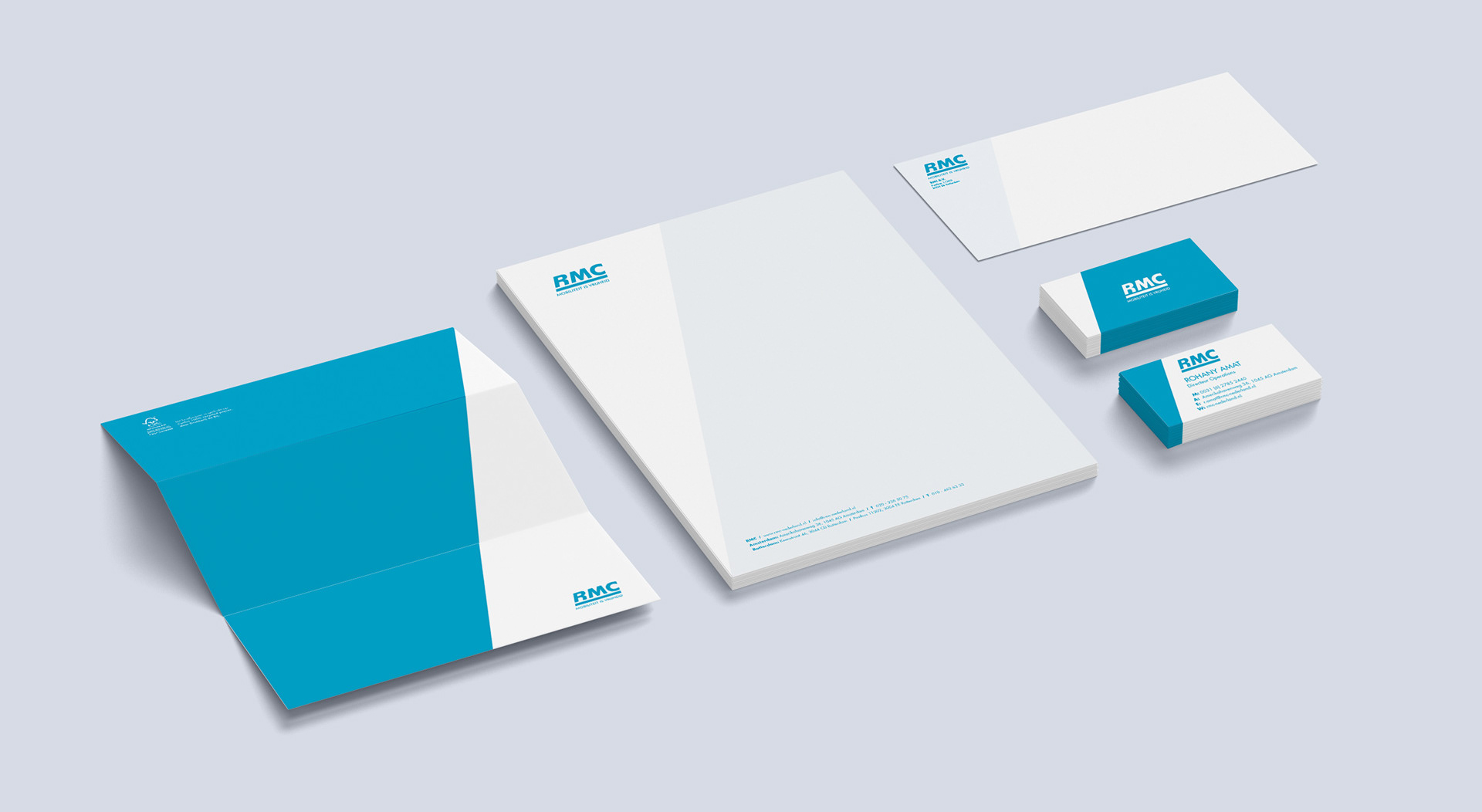
Brand design and roll-out of new brand: logo, business cards, letterhead and envelope, brochure, flyer, clothes, art direction photography, web design, app icon, brand guidelines. Design of environmental graphics of the office spaces in Amsterdam and in Rotterdam.
In partnership with:
Only Mondays (producer Rotterdam office).
Only Mondays (producer Rotterdam office).
-----
I got contacted for this project after that RMC signed a new contract with the city of Amsterdam. The company is originally from Rotterdam (Rotterdamse Mobiliteits Centrale) and wanted to seize the opportunity of starting to operate in the Dutch capital by refreshing its brand.
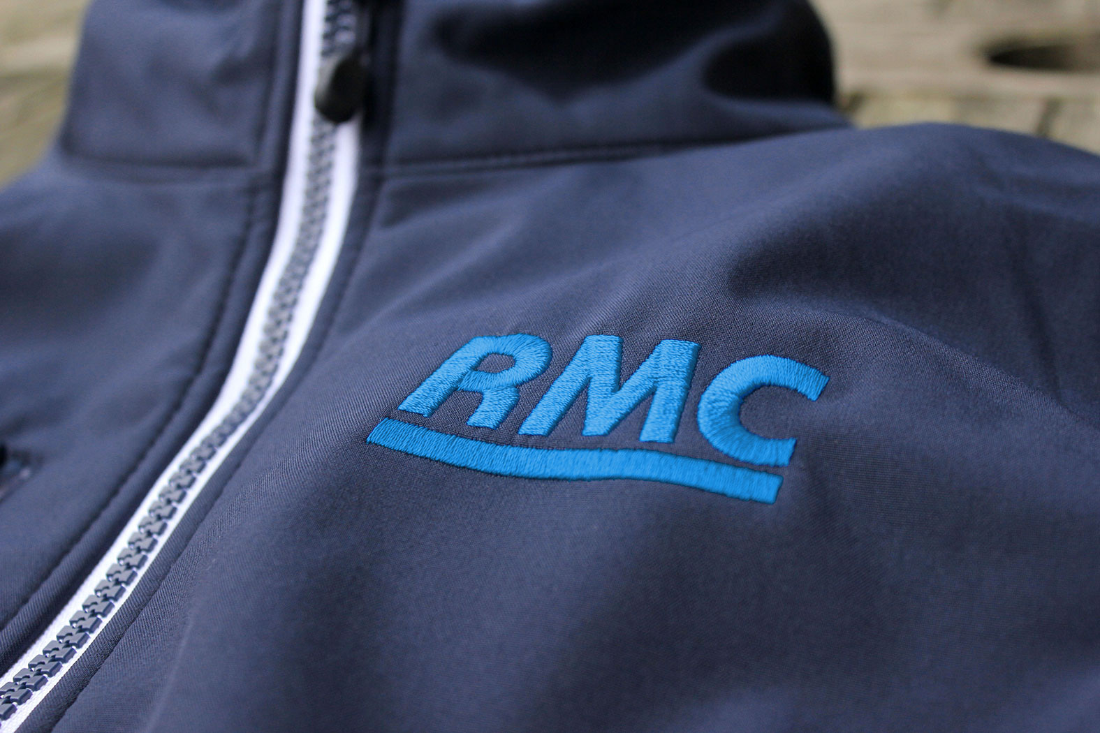
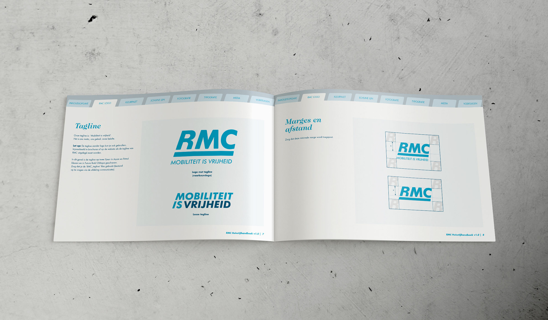
The client chose, among the proposed directions, the “safest” option, meaning the less revolutionary one (scroll down to see the other option proposed). That is why the new logo keeps the same look & feel and colour palette of the previous one, however its lines have been cleaned and rounded up to gain a friendlier look. The slanted line, metaphor of movement, has been introduced consistently in all brand assets.
The client chose, among the proposed directions, the “safest” option, meaning the less revolutionary one (scroll down to see the other option proposed). That is why the new logo keeps the same look & feel and colour palette of the previous one, however its lines have been cleaned and rounded up to gain a friendlier look. The slanted line, metaphor of movement, has been introduced consistently in all brand assets.
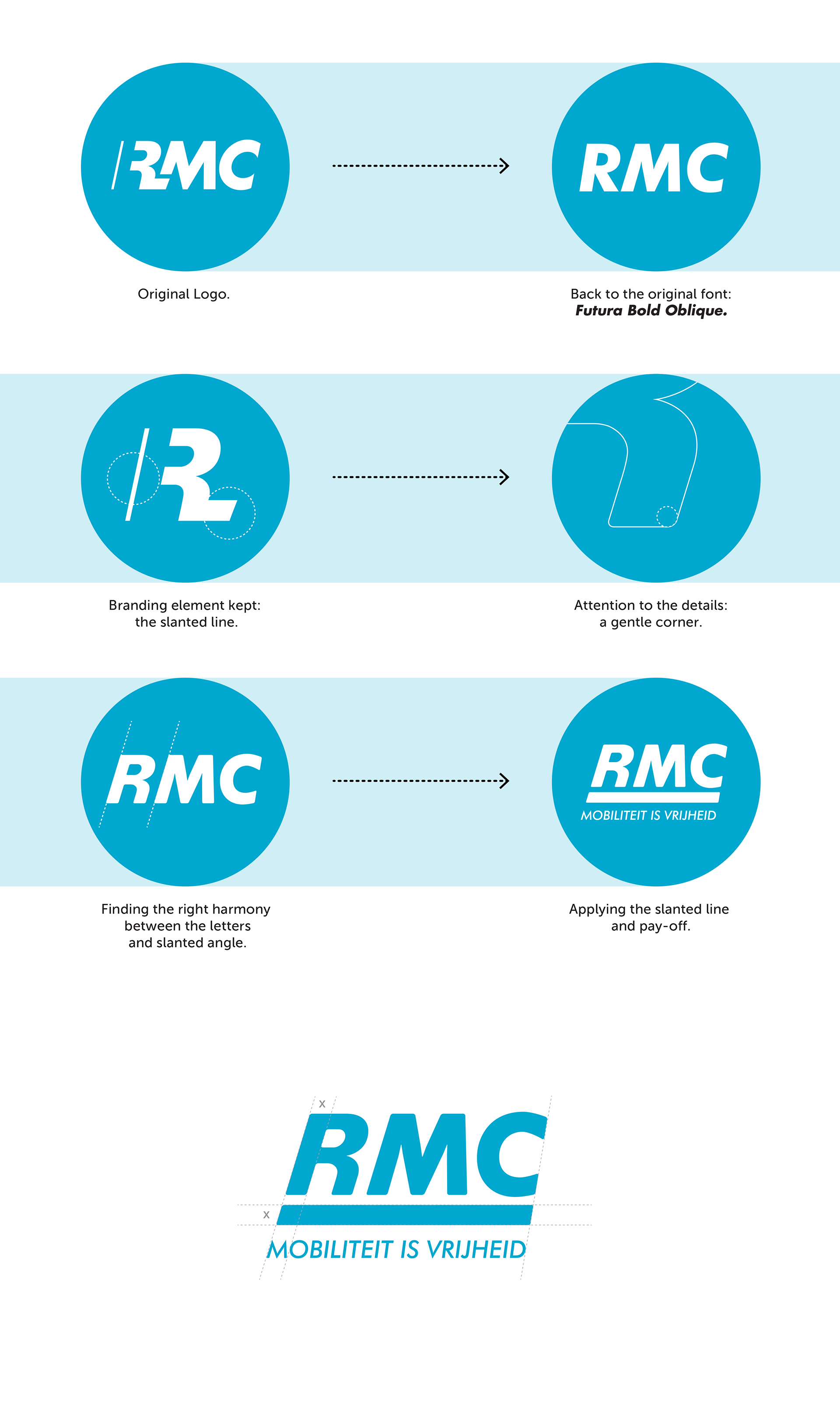
Applying the slanted line to the whole brand.
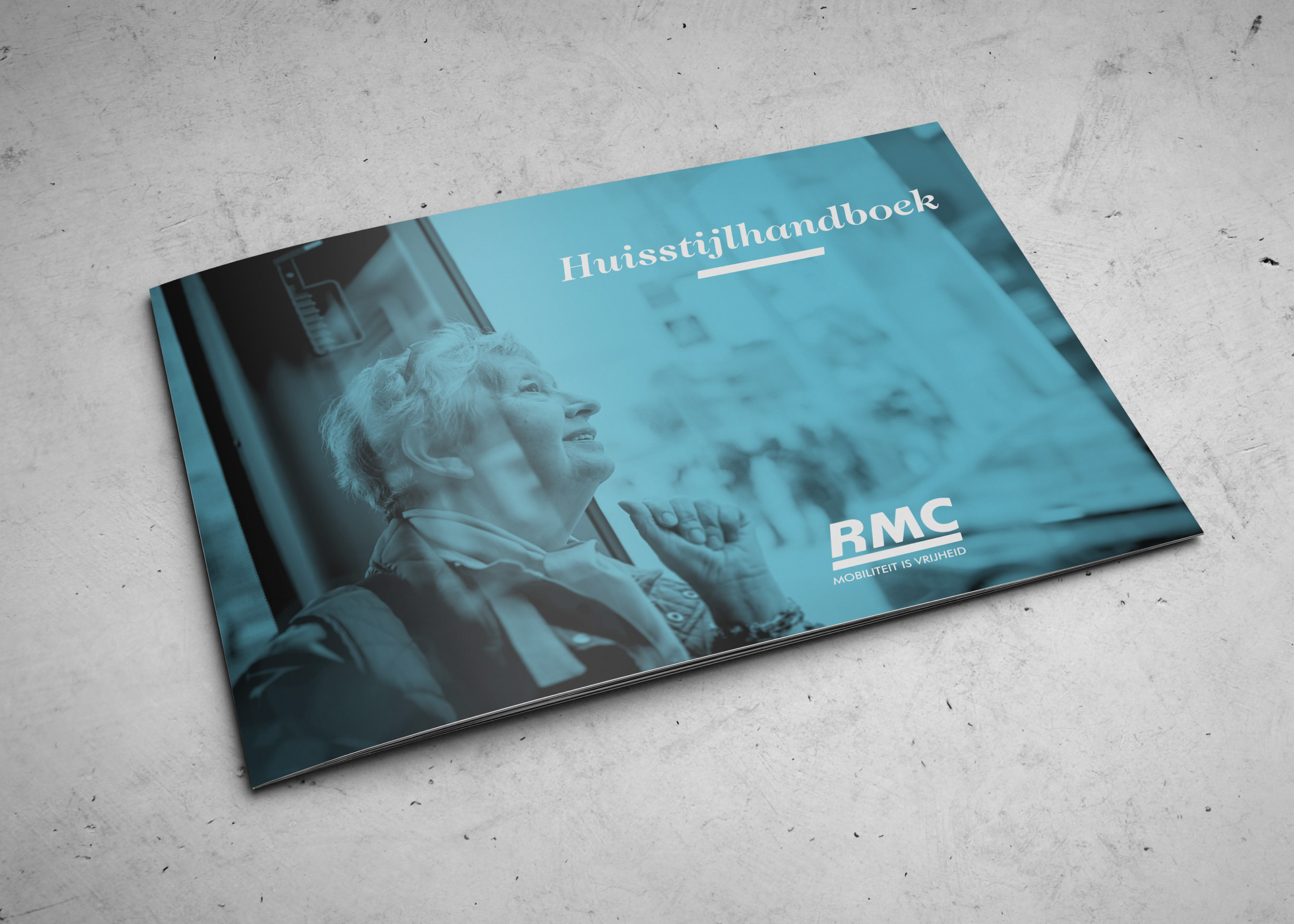
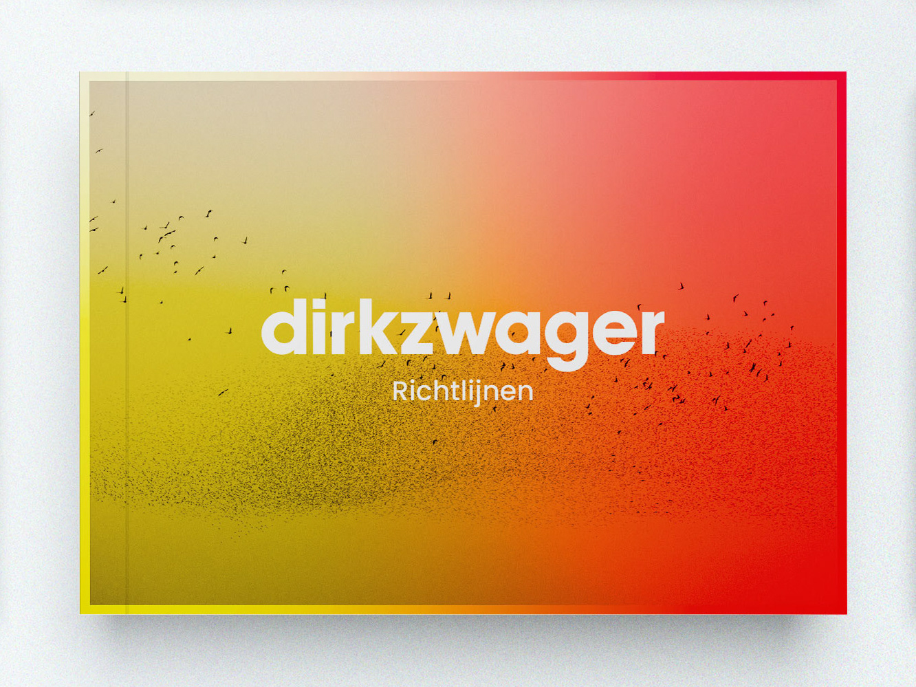
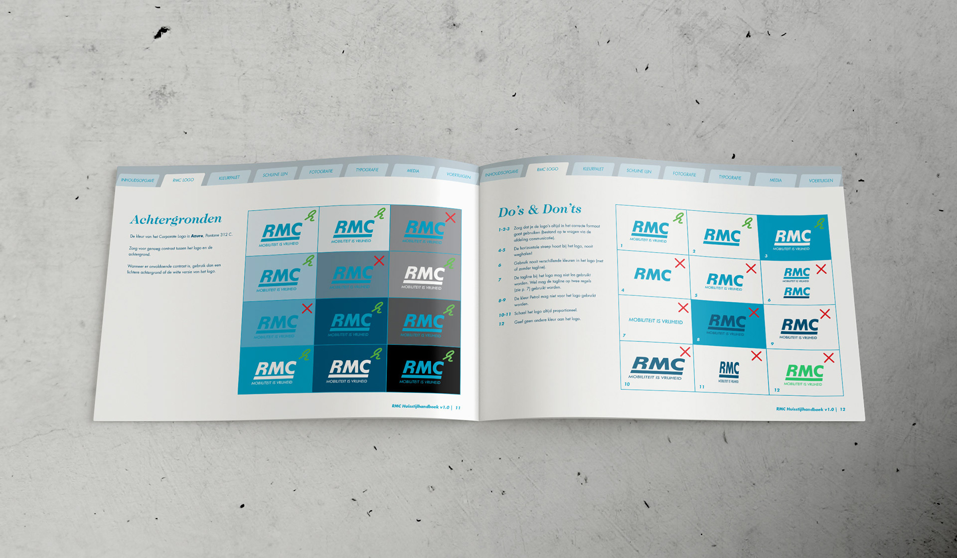
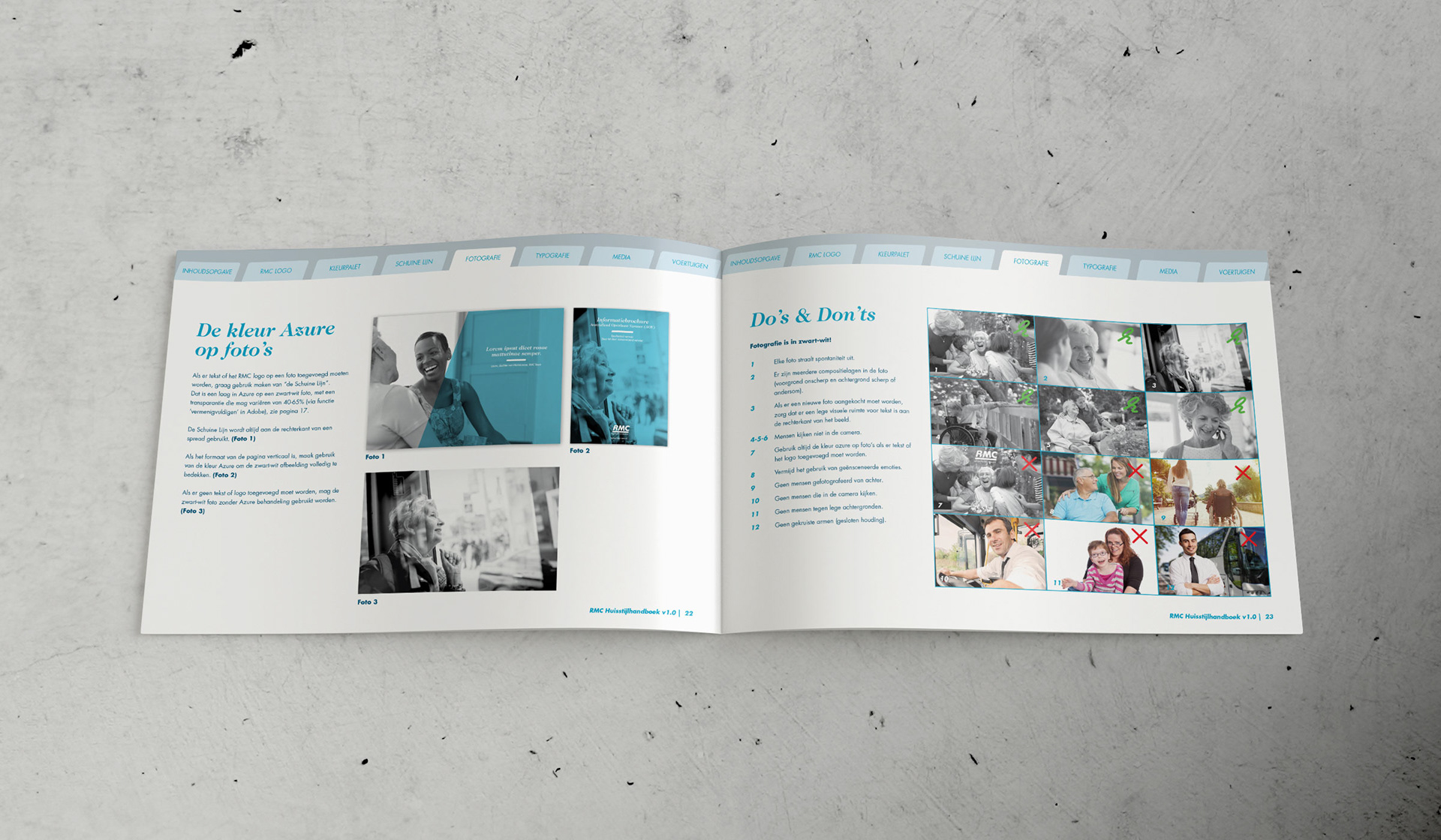
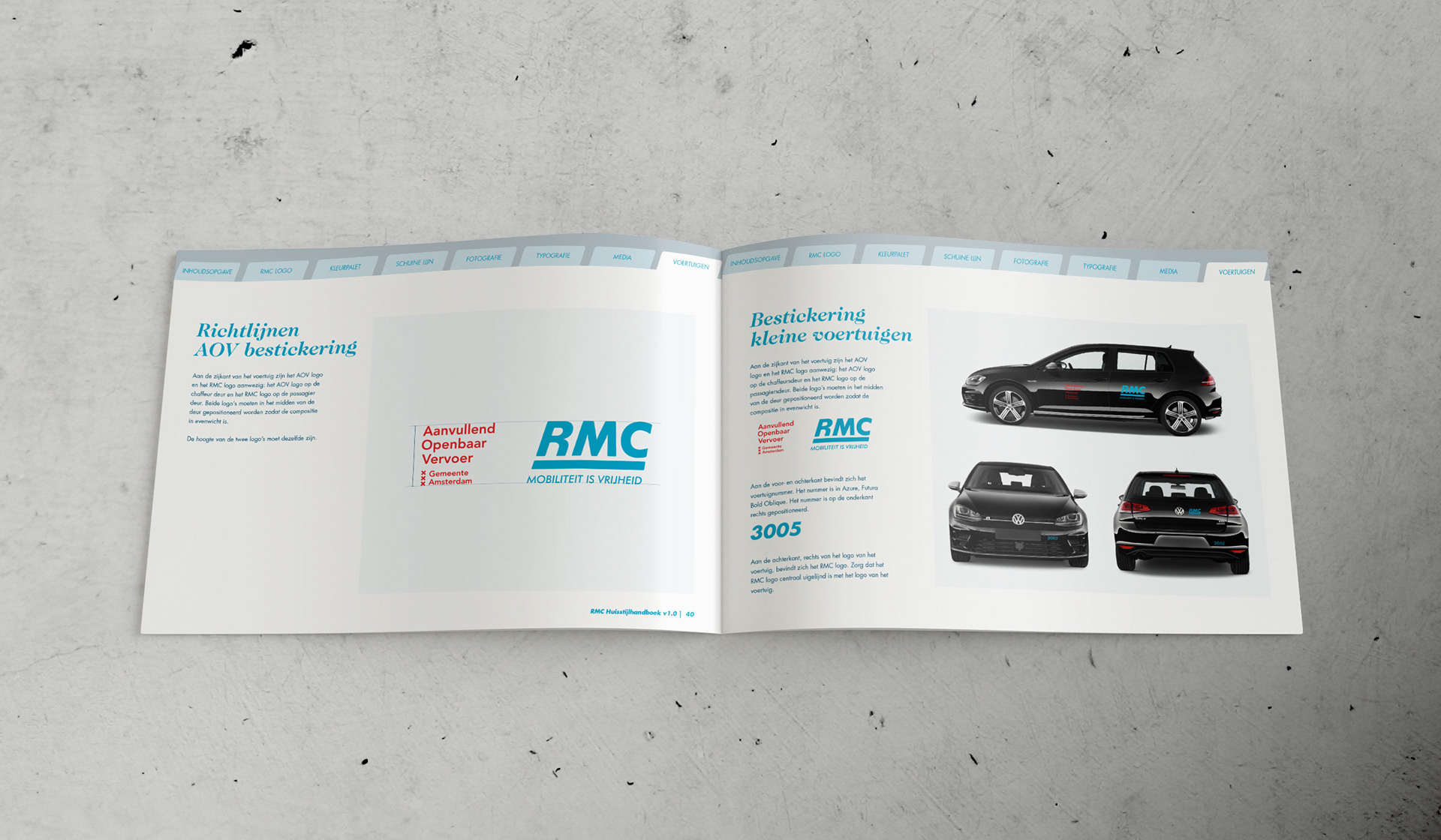
Brand guidelines.
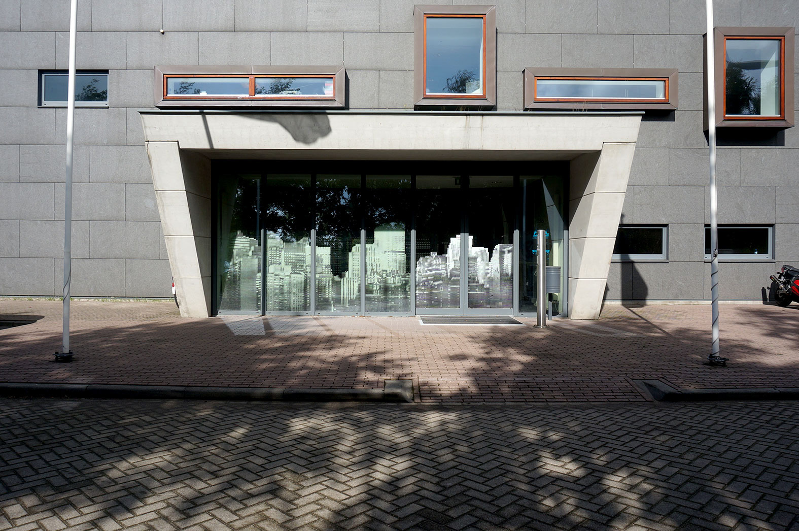
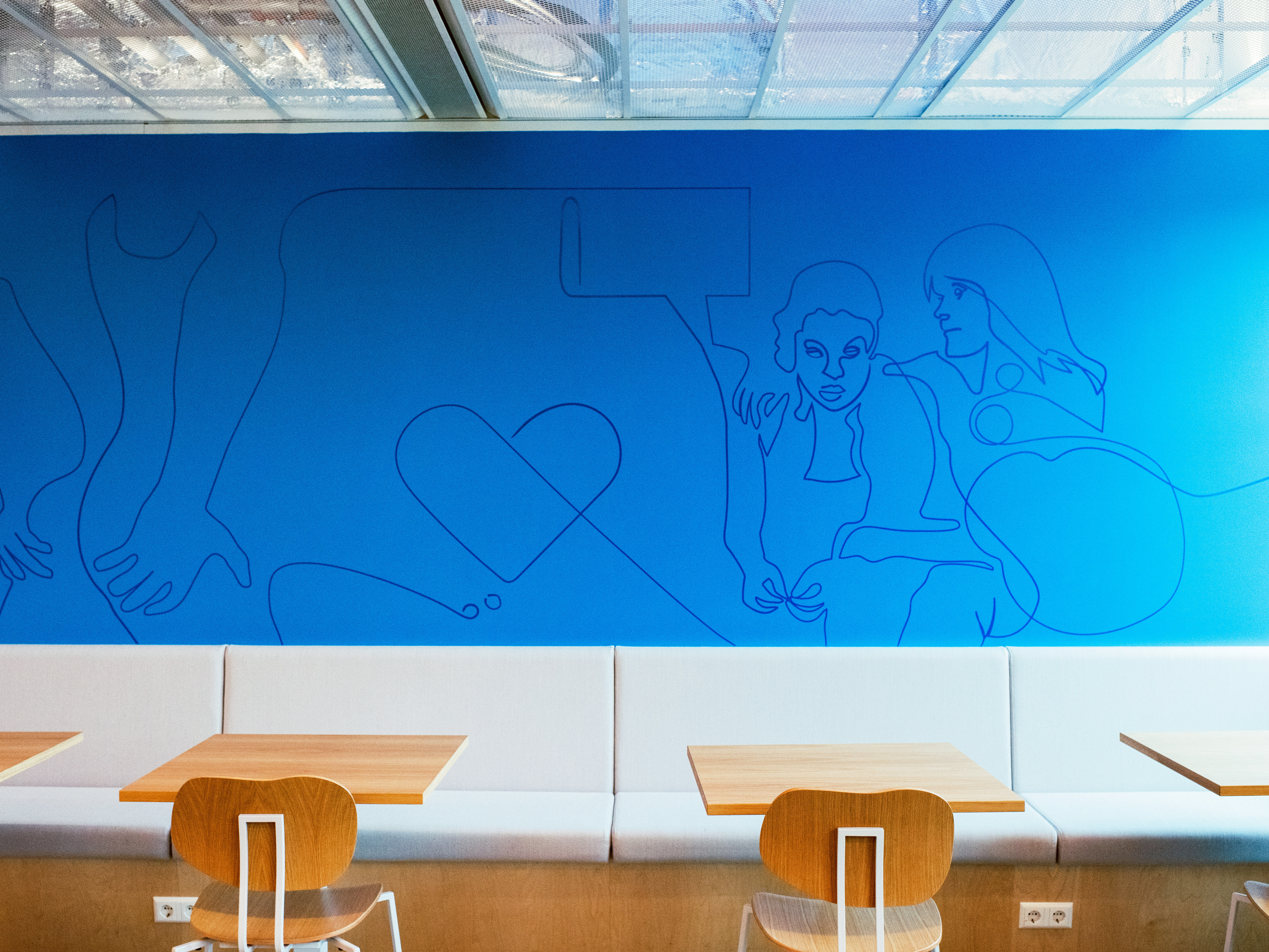
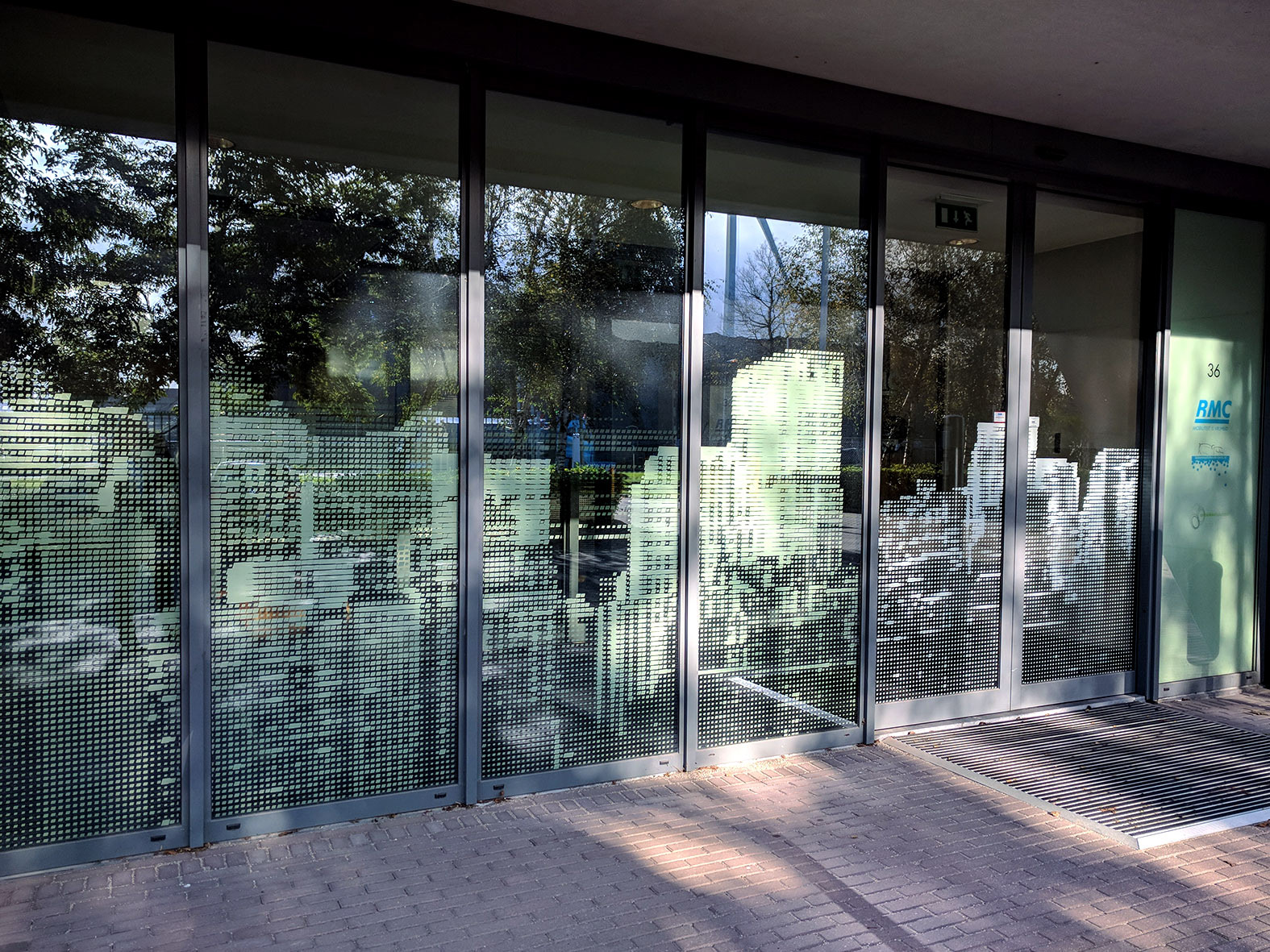
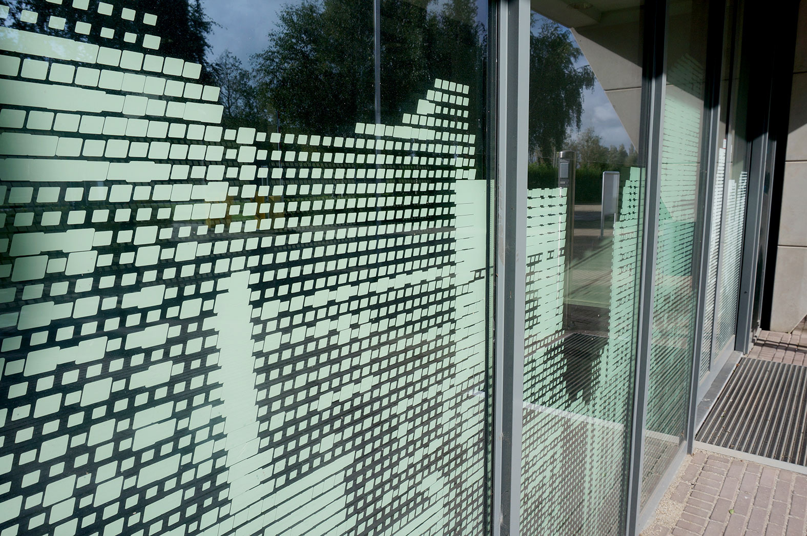
Entrance of the office space in Amsterdam.
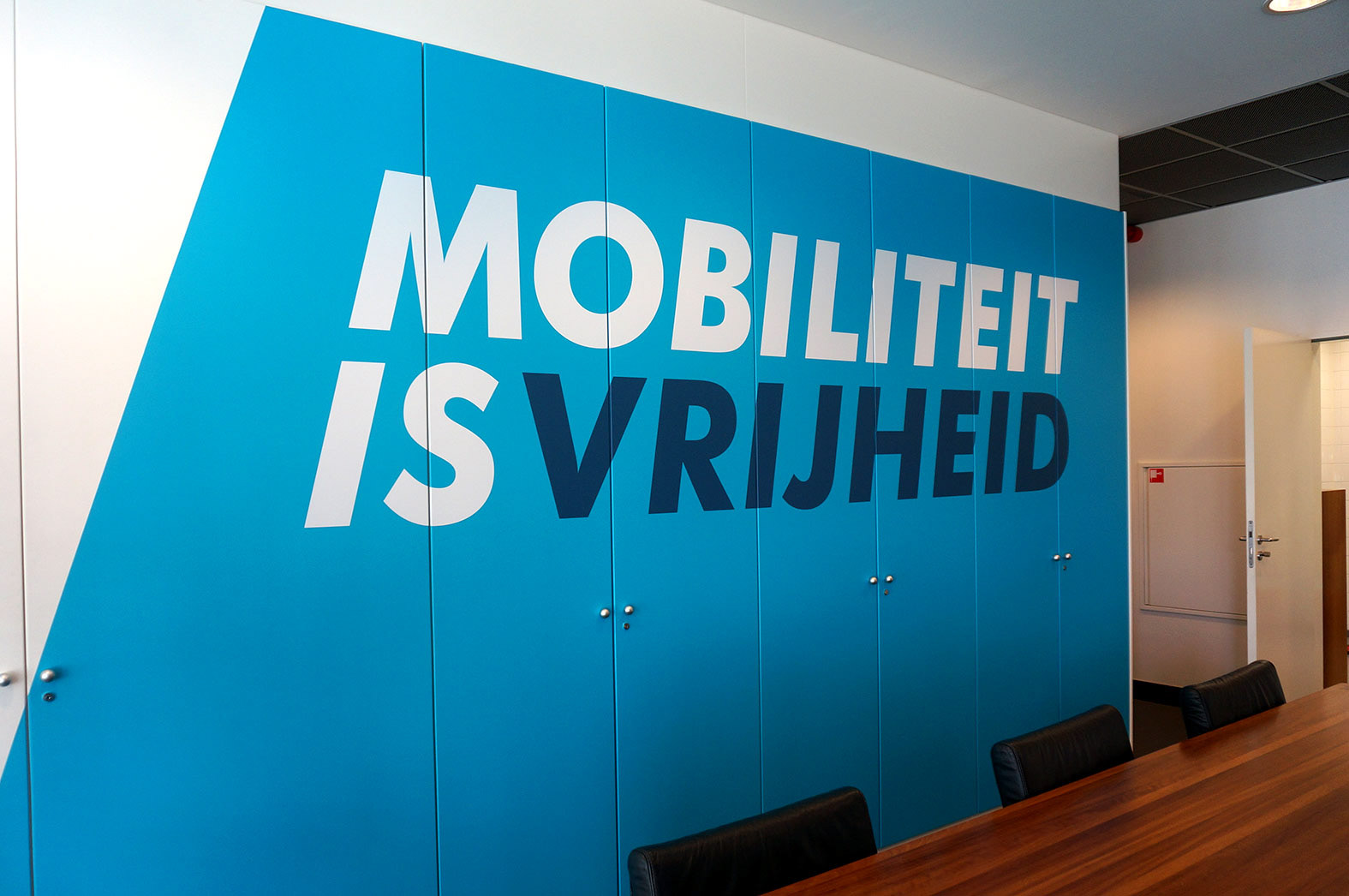
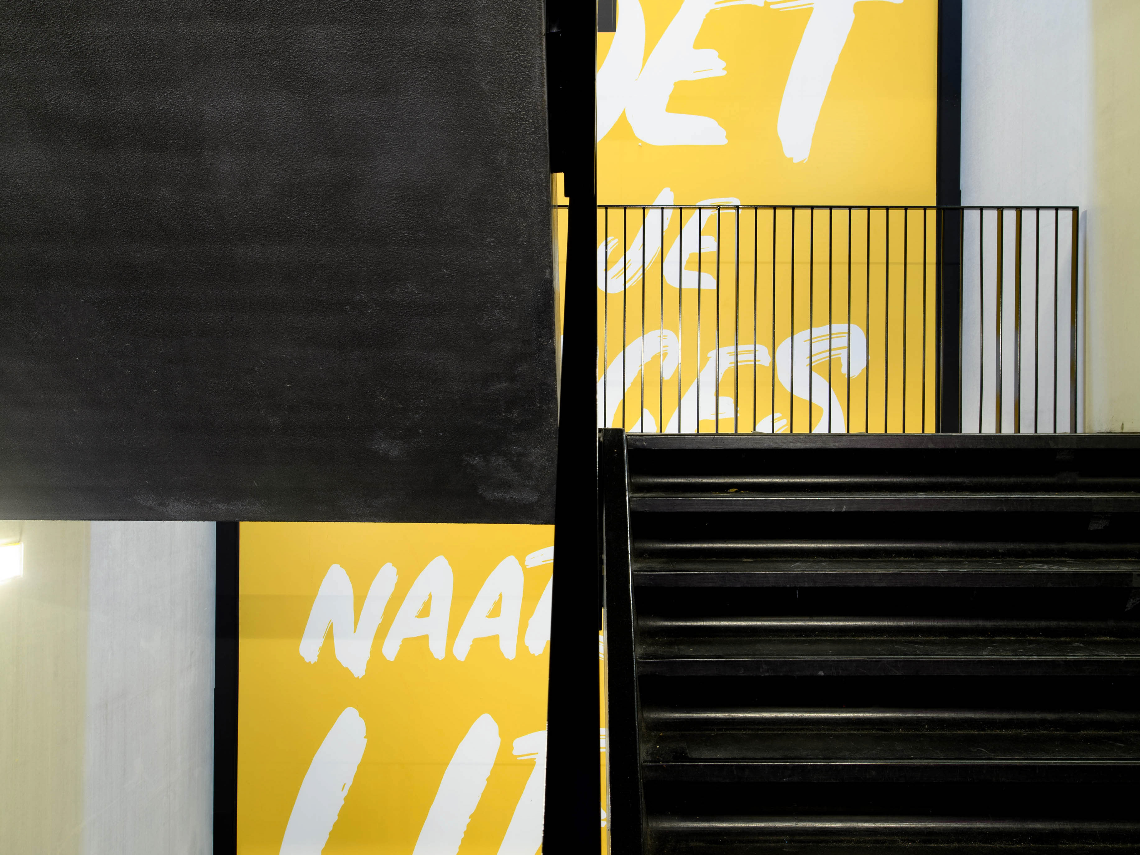
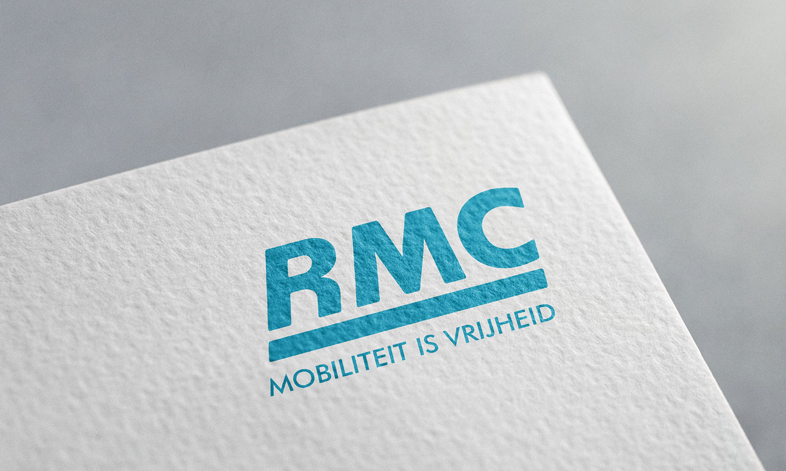
The pay-off of the company: Mobility is Freedom.
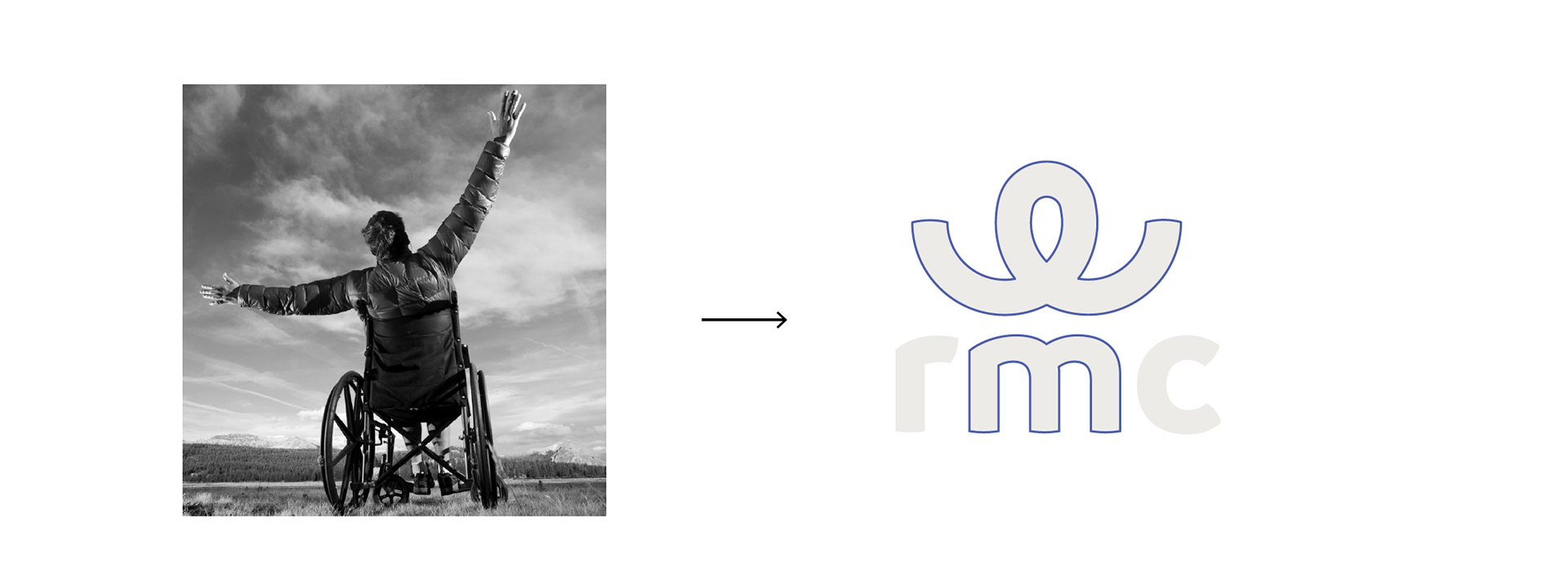
The following visuals belong to the "revolutionary" option that did not get chosen by the client. What is clever about this proposal is the icon, that literally embodies the user of the service and at the same time communicates collaboration and togetherness (&).